12 Templates, 43% Faster Community Launch
SaaS / No-Code Platform / UI/UX Design
Designed a collection of modular community website templates to help users build their sites faster and maintain visual consistency.

Company
Bettermode
All-in-one SaaS platform for building and managing online communities
Team
Moein Saboohi
Product Designer
Jacob Harris
Customer Experience Director
Amir Khalili
Creative Director
Duration
October 2024 – March 2025
5 months
Softwares

Figma

Adobe Photoshop
Overview
Users often struggled to create cohesive community websites from scratch, facing long setup times and inconsistent design results.
To address this, I worked on designing a collection of modular, industry-tailored templates that simplify the website-building process and guide users toward faster, more visually consistent launches.
As a result, for users who adopted the templates, community creation time decreased by approximately 43%, from a median of 28 days to 16 days. However, we also discovered that roughly 30% of new users bypassed templates entirely, revealing a discoverability gap that became a priority for the next iteration.
The Problem
Building a community website from scratch was slow, complex, and often resulted in inconsistent user experiences.
Many users struggled to create community websites efficiently. They faced long setup times, unclear structure, and inconsistent visual styles, challenges that discouraged them from launching or maintaining their online spaces.
Research
Our research combined two streams: quantitative market analysis and qualitative user input. On the quantitative side, we analyzed keyword search volume across target verticals (SaaS, fitness, gaming, freelancing) and reviewed Bettermode's platform analytics to understand where new users were dropping off during setup. The data revealed that over 60% of users who churned in their first week had never moved past the initial site configuration screen.
On the qualitative side, I reviewed 14 CX support transcripts and conducted informal interviews with 3 existing community owners who had taken significantly longer than average to launch. The consistent theme wasn't feature confusion, it was decision paralysis. Users didn't know what a 'good' community site looked like for their specific industry.
One finding we didn't expect:
two interviewees said they wanted fewer options, not more customization.
This directly influenced our decision to cap the initial library at 12 focused templates rather than the originally planned 20+, prioritizing depth over breadth.
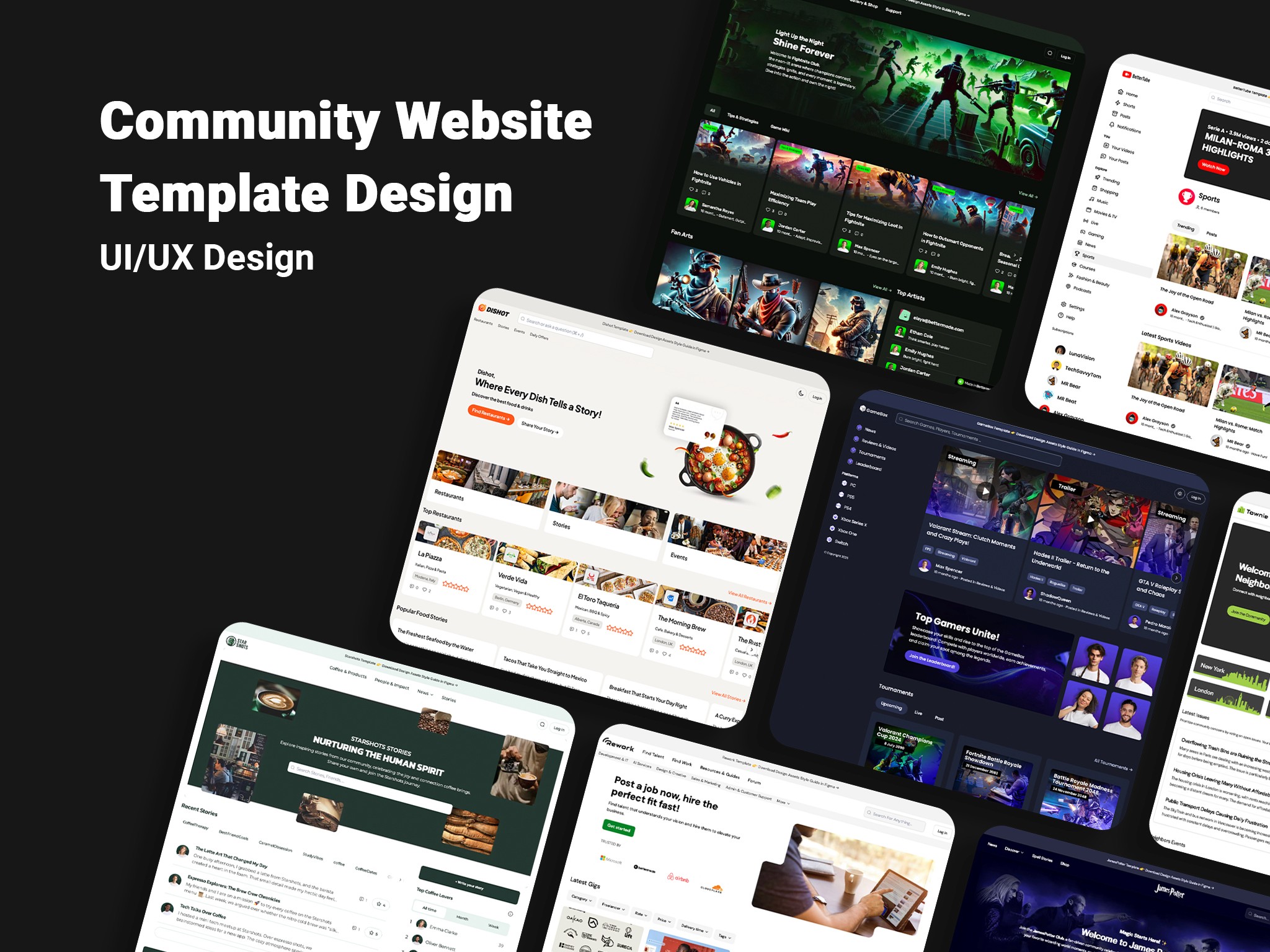
The combination of keyword volume data and CX transcript analysis pointed to four industries with the highest unmet demand and lowest existing template coverage: SaaS platforms, fitness organizations, gaming communities, and freelancer networks. These became the anchors for our first persona set.
User Personas
For every selected industry, we developed detailed personas to guide design decisions.
Examples included:
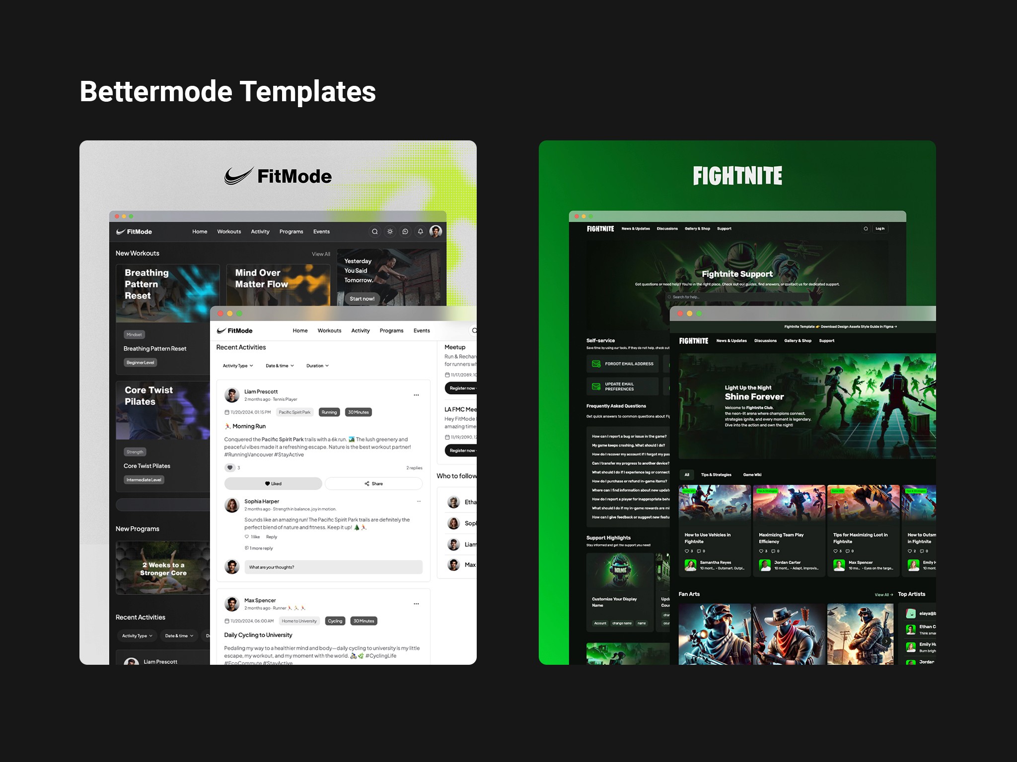
SaaS Founder Persona: Needs a community hub to engage users, share product updates, and gather feedback, with a professional, brand-aligned interface that builds trust and loyalty.
Fitness Coach Persona: Seeks an easy way to manage members, post updates, and organize group challenges.
Gaming Community Moderator: Needs intuitive navigation, forums, and event pages to engage members.
Freelancer Network Owner: Looks for professional presentation, clear onboarding, and collaboration features.
Each persona informed the tone, visual direction, and key features of its corresponding template.
Discovery
Before committing to templates as the solution, I mapped the problem space with the PM and CX Director. Leadership's initial assumption was that the issue was 'too many configuration options', so the proposed fix was simplifying the builder UI. I pushed back on this, because the analytics showed users weren't abandoning within the builder. They were abandoning before even starting.
I ran a short assumption-mapping session with the two stakeholders. We listed all competing hypotheses and scored them on importance and uncertainty. Three rose to the top:
The builder is too complex,
Users lack design inspiration and reference points,
Users don't know what content belongs on a community site.
After reviewing CX data and early user interviews, hypotheses 2 and 3 scored highest, which pointed clearly toward templates as the right intervention, not a UI simplification.
The original brief was to design 5–6 templates. Based on discovery findings, I made the case for 10+ industry-specific templates, so users could self-identify with a starting point that matched their context.
Design Goals
Enable users to build and launch communities faster.
Maintain visual and structural consistency across templates.
Create adaptable designs that fit multiple use cases and brand identities.
Ensure intuitive navigation and a positive user experience for both community owners and members.
Working with Stakeholders
This project involved three distinct stakeholder layers: internal team (PM, Creative Director, CX), platform clients (brands actively building on Bettermode), and end users. Managing these layers required different communication approaches.
With the Creative Director, I held a kickoff alignment session in the first week to agree on brand guardrails, specifically, what templates should and shouldn't do in terms of visual flexibility. This prevented scope creep later when subjective feedback like 'can we make this feel more minimal?' would arrive without a shared reference point.
The CX Director became my primary pipeline for real-user signals throughout the project. We established an async feedback loop: after each design checkpoint, I'd share a Loom walkthrough, and he'd collect informal reactions from 2–3 community owners who were in active setup. This let me get validated input without blocking the delivery timeline.
For ongoing design reviews, I introduced a structured format to avoid the usual 'design by committee' dynamic: 10 minutes of walkthrough with no interruptions, then 5 minutes of clarifying questions only, then feedback, then a decision before leaving the room. This kept sessions under 45 minutes and reduced revision loops significantly.
One real tension: the PM wanted templates to prominently showcase premium features to drive plan upgrades. My research suggested that surfacing too many advanced options upfront increased decision anxiety and actually slowed launches. We resolved this with a progressive disclosure approach, templates appear clean on first view, with premium features accessible only in the customization layer. Neither side got everything they wanted, but the compromise was grounded in data.
Ideation
Before producing any wireframes, I facilitated a half-day ideation session with the PM and Creative Director. We used a 'How Might We' exercise to reframe the problem space, generating 23 HMW statements that we then dot-voted down to 5 core design principles. One of those principles 'make the first impression feel intentional, not overwhelming' became the anchor reference point every time we debated layout complexity later in the project.
Idea to design
We started by mapping out potential site architectures for each community type.
Using low-fidelity designs, we explored variations in layout and feature placement, testing ideas for member interaction, navigation flow, and visual hierarchy before finalizing structures.
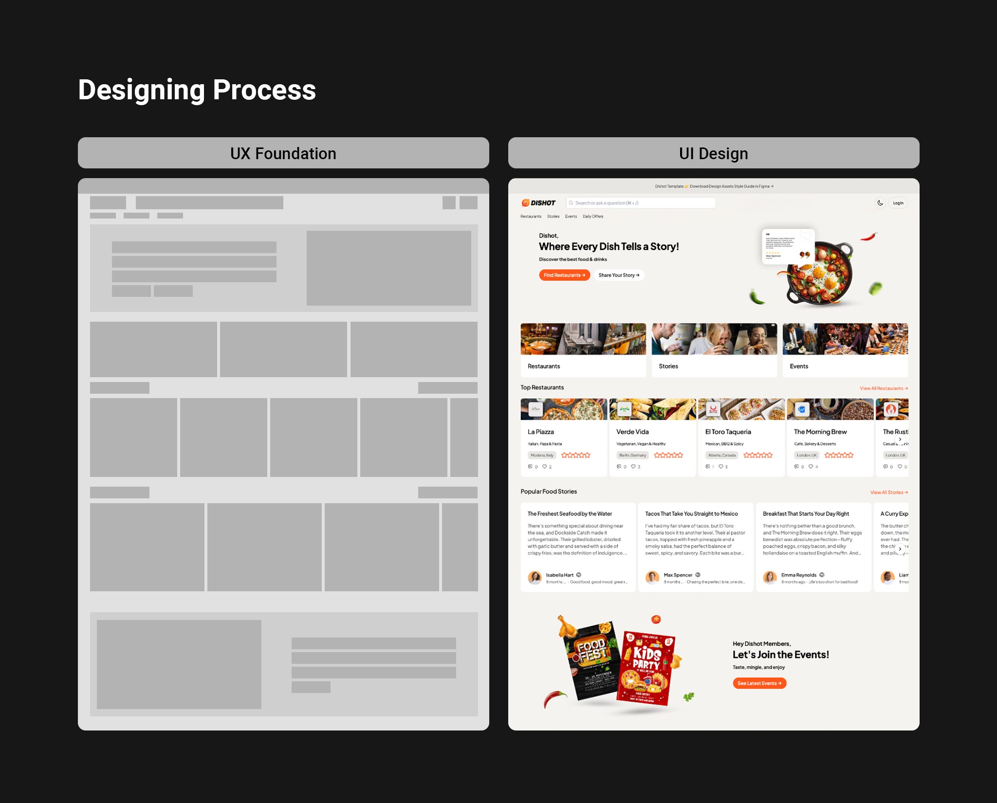
Designing Process
The design process was divided into two phases:
UX Foundation:
Defined layout structures, navigation flows, and component placement.
Prioritized user goals through information architecture and wireframes.
UI Design:
Developed visual systems using color palettes, typography, and design assets tailored to each audience.
Ensured accessibility, responsive behavior, and visual harmony across templates.
We designed directly in Figma, integrating design tokens and component libraries for reusability.
User Testing Process
We ran two rounds of usability testing. The first round involved 5 existing Bettermode users who were shown mid-fidelity designs of three template concepts.
The main finding: users understood the layout quickly but struggled to imagine how their own content would fit in.
This led us to add realistic placeholder content, actual community posts, member counts, and event titles, rather than generic 'Lorem Ipsum' filler, which significantly improved how users evaluated the templates.
The second round was conducted post-launch through our CX team, who gathered structured feedback from 8 community owners in their first two weeks of using a template. The most common piece of feedback was that CMS posts preview wasn't visible during setup, a gap we added to the next sprint backlog.
Success Metrics
We tracked outcomes across three areas over 90 days post-launch.
Build time: Internal analytics compared median days from account creation to first published site. Before templates: ~28 days. After template adoption: ~16 days, a 43% reduction for users who started with a template. However, we also found that roughly 30% of new users ignored the templates entirely and started from scratch anyway. This was unexpected. It suggested that template discoverability, or how we were positioning them in the onboarding flow, still needed work, and became a priority for the next iteration cycle.
CX ticket volume: We compared onboarding-related support tickets in the 60 days before and after launch, controlling for a concurrent onboarding tooltip update that happened around the same time. Net reduction in 'how do I start' and 'site setup' tickets was approximately 23%. We were careful not to attribute this entirely to templates, since the tooltip update likely contributed as well.
Template adoption rate: Grew steadily for the first 3 months, then plateaued. This led us to hypothesize that our 12 templates covered the most common use cases well, but edge cases, nonprofit communities, local event organizers, professional networks, weren't represented. This gap informed the next roadmap cycle.
Key Insights
Data gathered from usage analytics, user feedback, and CX reports revealed several patterns:
Cross-industry UX overlap: When we reviewed the 12 templates side by side, the navigation structures, content hierarchies, and member interaction patterns were nearly identical across industries, only the visual language differed. This suggested that Bettermode's core UX model is industry-agnostic, which has implications for how we onboard new users: the same interaction patterns apply whether you're a fitness coach or a SaaS founder.
The 30% who didn't use templates: The most actionable insight came from the users who bypassed templates entirely. Exit interviews with 4 of these users revealed a common reason: they felt the templates 'didn't look like their brand' before customization. This pointed to a positioning problem, we were showing templates in their default state, not in a customized form. A 'before and after' preview became a planned feature for the next cycle.
Scope discipline matters: The decision to cap the library at 12 templates (down from 20+) based on user feedback proved correct. The 12 templates collectively covered ~70% of actual use cases based on adoption data. Building 20 would have diluted focus without meaningfully increasing coverage.
Iteration and Improvement
Templates evolved continuously with new platform features and user feedback.
As the platform evolved, we regularly updated templates to align with new features, design standards, and user expectations. Each update cycle included minor UX adjustments, visual refinements, and performance optimizations based on real user behavior and CX insights.
Outcome and Future Enhancements
A living system of templates that continues to grow with user needs and platform evolution.
The result is a cohesive ecosystem of modular, user-friendly templates that empower anyone, from creators to businesses, to build communities effortlessly.
Moving forward, we plan to introduce AI-assisted template recommendations, advanced customization tools, and localized design variations to enhance accessibility and global relevance.
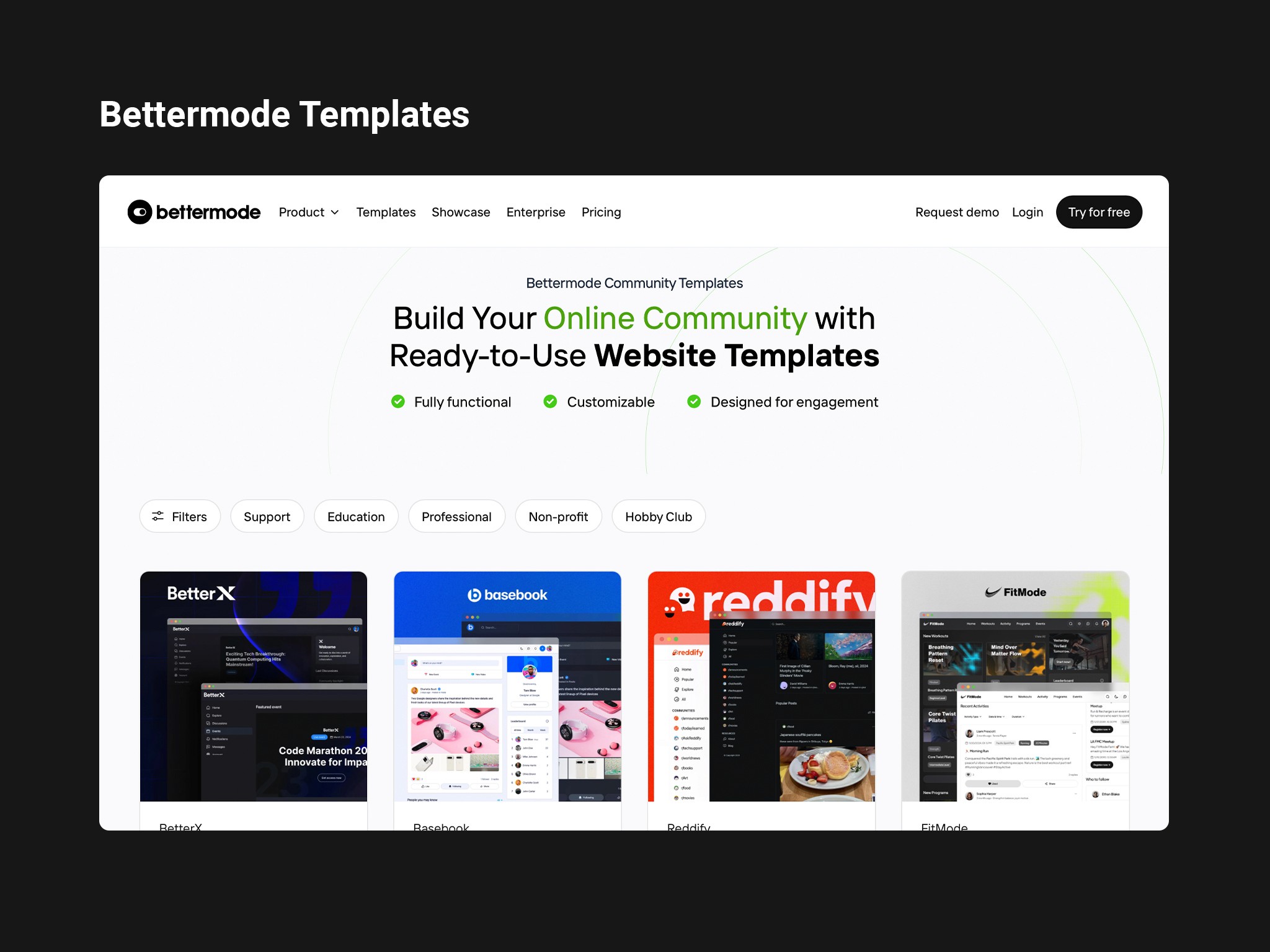
Below, you can see a selection of the designed templates: