A Shared Design System for Bettermode Apps
SaaS / Design System / AI Workflow
Designed shared tokens, components, and guidance for Bettermode's app ecosystem, then made them available to AI coding tools through MCP. Component reuse passed 70% across new apps in the first quarter.
Company
Bettermode
All-in-one SaaS platform for building and managing online communities
Team
Moein Saboohi
Senior Product Designer
Ali Aghamiri
Developer & Solution Engineer
Amir Khalili
Creative Director
Duration
June 2025 - December 2025
6 months
Softwares
Figma
Notion

Cursor
Overview
Bettermode's app ecosystem had grown without a shared reference for interface components. Similar actions looked and behaved differently across apps, and teams rebuilt patterns that already existed elsewhere.
I designed a token-based system for the app layer, working with Ali Aghamiri, Developer and Solution Engineer, and Amir Khalili, Creative Director. My work covered shared foundations, component guidance, and documentation for design and implementation. I involved engineering in the system's naming and organization, then made those resources available through MCP in an AI-assisted coding workflow, using Cursor alongside Bettermode's developer documentation.
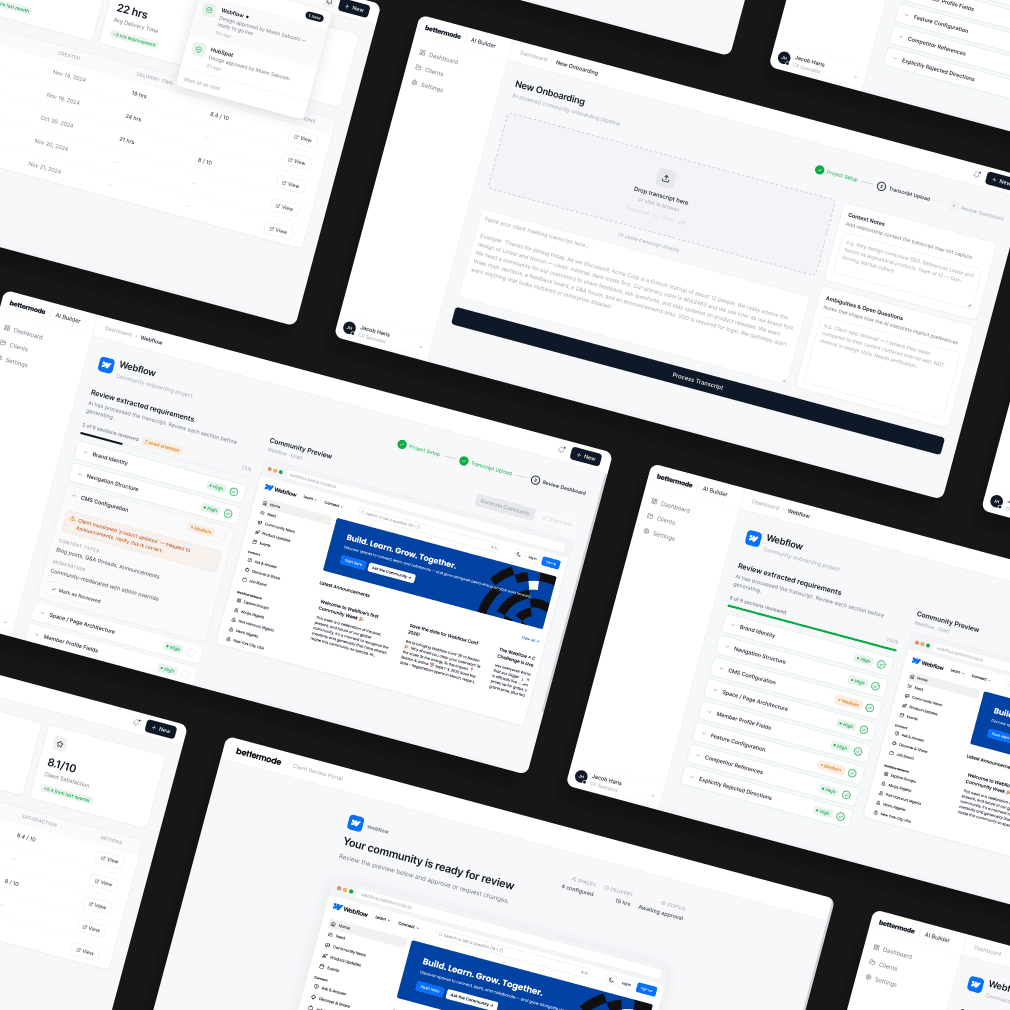
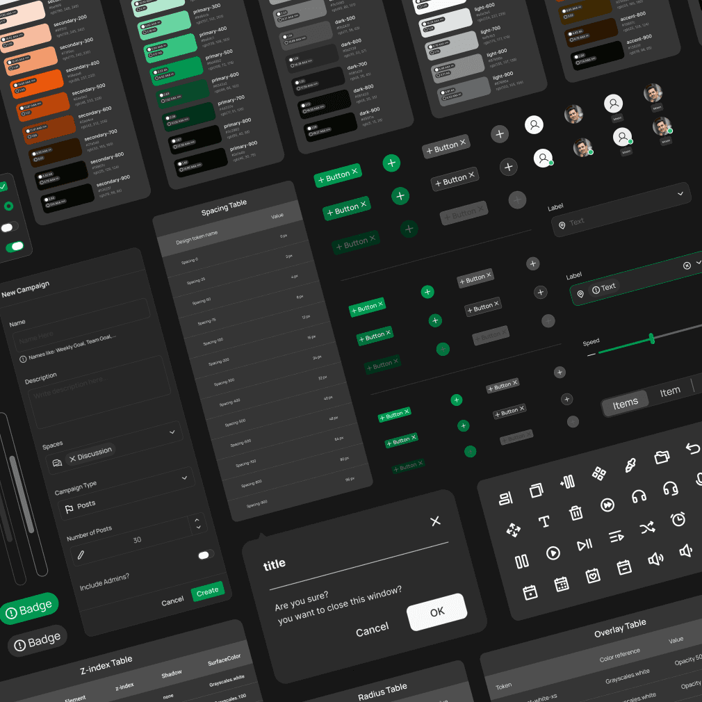
The shared library: foundations and components used across Bettermode apps.
Finding the gaps across 14 apps
The audit identified nine button styles, six spacing scales, and four approaches to error states across 14 existing apps. Interviews with three developers showed a practical need: a reference they could use while building, with clear states and implementation examples.
The scope was the app ecosystem. The goal was to help app teams follow the core product's design language without making each team reconstruct it from existing screens.
Choosing shared tokens and documented components
I compared three interventions: documentation alone, a component library without shared tokens, and a token-based component system. Documentation alone left developers to interpret visual rules manually. A library without shared tokens would still require repeated updates when foundations changed.
We chose shared tokens and components, with documentation in Figma and code. I involved engineering before building the library to agree on naming and organization. We grouped components by function so developers could find the pattern they needed for a task.
We chose shared tokens and documented components so app teams could work from the same foundations and implementation guidance.

Project sequence from the app audit to shared components, documentation and MCP developer guidance.
Foundations that could be reused across apps
The token library covered color, typography, spacing, radius, elevation, opacity, borders, grids, overlays, and z-index. Shared definitions made these decisions explicit and reduced the need to choose values independently for each app.
Tokens were represented in Figma and code. Components that used those definitions could follow updates to the shared foundations; adoption still depended on teams using the system.

Shared design tokens for spacing, radius, overlays, z-index, elevation, and color.
Figma variables showing the shared definitions behind the component library.
Documentation for design and implementation
Developer guidance covered component states, variants, and code examples. Designer guidance covered usage, spacing, and examples of appropriate and inappropriate use. The two layers addressed different tasks while referring to the same components.
Two developers continued to use custom components for specialized cases. We reviewed that work as potential additions to the library, and three components were added. This gave us a way to extend the system when shared patterns did not yet cover a product need.
Custom components revealed gaps in the library. Reviewing those cases gave us a way to extend the shared system.
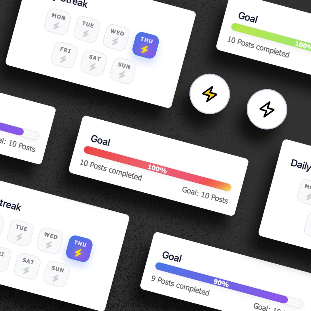
Button behavior across hover, press, loading, and completion states.
Extending the system into an AI-assisted coding workflow
After the design system launch, I made the system and Bettermode's developer resources available to AI coding tools through MCP. Cursor was the tool used in the initial workflow. The workflow brought component guidance, token definitions, and API documentation into the context used to generate app code.
Component states and token definitions described how the interface should behave and look; API documentation described how it connected to Bettermode. Bringing both into the coding workflow made the same references available during implementation, rather than leaving a developer to assemble them separately.
The AI-assisted coding workflow brought component behavior, token definitions, and API documentation into the same implementation context.

Design system and developer documentation connected to an MCP-assisted app workflow.
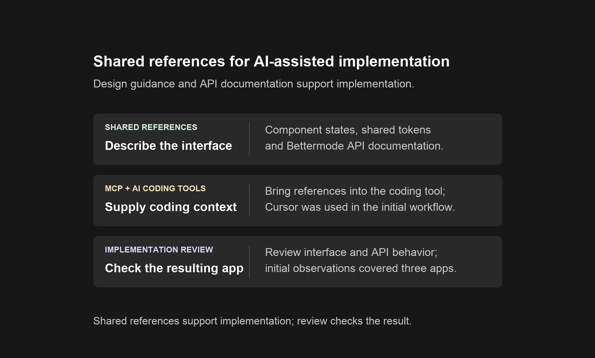
Summary of the reference workflow. MCP made guidance available during implementation; it did not replace review of the resulting interface or API behavior.
Adoption and consistency
The project reported component reuse above 70% across new apps in the first quarter. Design inconsistency findings per app fell from 8–12 to 2–3. Reuse and inconsistency findings measured different things: use of shared components, and issues identified during app review. These results concern the app ecosystem, rather than the whole Bettermode product.
In the initial review of three apps built through the Cursor workflow, no visual-consistency corrections or API integration errors were reported. That observation is limited to those apps and the review performed; it does not establish correctness across all states or future generated code.
The work described here covered shared foundations, component guidance and the connection to developer resources. The MCP connection should not be read as automatic Figma-to-code synchronization or as evidence that generated code was checked for every accessibility and performance requirement.
What I learned
A design system needed to fit the work of developers as well as designers. Shared values alone were insufficient without states, examples, and guidance that teams could use during implementation.
Custom components helped reveal where the library needed to grow. Reviewing those cases created a more useful system than treating every departure as an adoption failure.
The AI-assisted coding workflow extended the same reference material into another development context. Its value depended on the quality and coverage of the system and documentation behind it.